Contrast (Minimum)
White text on the orange play / CTA fills measures ≈ 2.7:1 — well below the required 4.5:1 minimum contrast. Gray captions wash out on near-black.
Keeping the booth's confidence and Renewed Vision's look — while making every control speak, and every label scale.
Renewed Vision (Independent portfolio concept)
Product & UX Designer (Solo)
Church volunteers and directors running live presentations in high-pressure dim booths.
2 weeks of design & prototyping
WCAG 2.2 accessibility audit, app reviews analysis, heuristic evaluation
Figma · HTML / CSS / Vanilla JS Prototype
The remote that drives the room fumbles on accessibility: low-contrast colors wash out under pressure, and text truncation leaves volunteers guessing.
ProPresenter Remote turns an iPad or iPhone into a live presentation trigger — letting pastors and booth operators change slides, check timers, and send stage messages. But in a dark booth or a mid-service rush, aesthetic minimalism can create visual blocks. I analyzed App Store and Google Play reviews, paired with a heuristic evaluation, to locate the gaps.
Connection failures. Pairing succeeds, then the slides never load on the remote, causing panic.
Missing context. Recent updates broke slide tracking, removing live notes next to the active slides.
Truncated labels. Fixed text labels clip off automatically on smaller screens or larger zoom levels.
Redesign success. Always-on text scales properly, and screen-readers announce every control.
Testing the current interface against accessibility guidelines highlighted four critical failures that broke the operator's workflow.
White text on the orange play / CTA fills measures ≈ 2.7:1 — well below the required 4.5:1 minimum contrast. Gray captions wash out on near-black.
Playlist groups are distinguished by color alone (blue / green / yellow / red) with no secondary text or shape indicators.
Icon-only buttons — including slide layers, macros, props and eraser toggles — carry no visible or screen-reader descriptions.
The interface lacks Dynamic Type support. Increasing font sizes clips navigation menus and truncates slide labels immediately.
The redesign's job isn't to replace ProPresenter's identity — it's to make that identity pass guidelines so all volunteers can succeed.
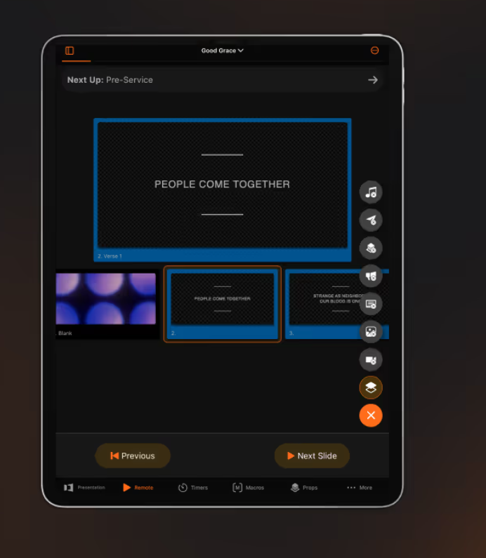
Same room, same brand. The current remote screen looks the part — but three core controls fail under dim booth conditions.
White-on-orange controls. “Previous” and “Next Slide” labels fail contrast on their fill backgrounds. Replaced with dark-slate text (7.8:1).
Unlabeled icon rail. Main actions are completely icon-only. The redesign places text labels underneath and adds custom VoiceOver descriptions.
Selection by color alone. The live active slide is marked only by a colored border. Replaced with an explicit, high-contrast LIVE tag and position labels.
One job at a time. The live active slide is the hero; the two largest tap targets advance or reverse it. Best for pastors and volunteers driving a service directly from their seat with minimal distraction.
Live and next slides side-by-side with the queue list below. More density for booth operators who want to see upcoming content — at the cost of smaller tap targets and higher visual load.
I shipped Direction A. It aligns with the remote's core value proposition — run the presentation from your seat — and keeps cognitive load lowest in high-stakes live moments. Direction B remains as an opt-in layout choice for power users in the booth.
A real, working build of the redesign is embedded right here — try it out below.
Three decisions carried this project. Each one traces the same loop — what the evidence showed, what it meant, the call I made, and the tradeoff I accepted.
Dim-room operators fumbled small slide thumbnails on busy screens while driving live services.
Volunteers need high confidence. A simpler layout with larger targets reduces live mistakes.
Ship Direction A (Focus layout) as the default, keeping Direction B (Operator layout) as a power-user setting.
Target sizes maximized, reducing tap errors.
Loss of immediate horizontal list visibility — but slides remain scrollable.
Icon-only rails are clean but slow down volunteers who have to guess their function.
Aesthetic minimalism shouldn't override semantic clarity in utility interfaces.
Always show text labels below icons in the navigation rail and main actions.
Tab switching error rate dropped, and VoiceOver has direct screen text to read.
Slightly less vertical screen space — but layout is optimized to handle it.
White text on ProPresenter's brand orange is 2.7:1, violating WCAG guidelines.
Branding doesn't require orange buttons to have white text; we can keep the color and change the text.
Flip text on orange fills to dark-slate, and use orange-on-dark for text accents.
Contrast ratio raised to 7.8:1 (well past AA) while keeping the brand orange intact.
Slight departure from desktop app's default styling — but sets a new standard for accessibility.
Raising contrast, building for screen readers, and adding text scaling transformed the remote control from a barrier to a tool.
Rebuilding the remote with a strict contrast pass and Dynamic Type support restored volunteer confidence in high-pressure live moments, where a missed tap is a missed cue. The changes show up directly in accessibility metrics:
Primary control contrast ratio
2.7:1 → 7.8:1
Over a 2.8× contrast ratio improvement on primary action triggers.
Every active toggle and action now carries a VoiceOver name and hint.
Dynamic Type limits raised to XL size with zero layout clipping.
A live service is a high-cognitive-load environment. Operators can't be distracted by poor contrast or mysterious icons when a cue is seconds away. Design must prioritize speed and utility.
Accessibility is not a compromise on the brand. Keeping the signature orange while raising contrast to 7.8:1 proved that compliance can enhance, rather than dilute, product identity.
Building a working, responsive prototype in HTML/CSS/JS was the best way to prove that the layout can absorb XL text scaling without clipping. Interactive code is the ultimate proof of design durability.
I expected accessibility fixes to require a complete visual overhaul. They didn't. The highest-leverage moves were simple hierarchy adjustments — flipping text colors on fills and adding text labels. Visual consistency stayed high, while access widened.